☰
Introduction to Graphs
The following graph shows the temperature of a patient in a hospital, recorded every hour.
(a) What was the patient’s temperature at 1 p.m.?
(b) When was the patient’s temperature 38.5° C?
(c) The patient’s temperature was the same two times during the period given. What were these two times?
(d) What was the temperature at 1.30 p.m.? How did you arrive at your answer?
(e) During which periods did the patients’ temperature showed an upward trend?
(a) The patient’s temperature at 1 p.m. was 36.5°.
(b) The patient's temperature 38.5° C was at 12 noon.
(c) The patient's temperature was same at 1 p.m. and 2 p.m.
(d) The patient’s temperature at 1:30 p.m. was 36.5° C [because the temperature of the patient was constant (i.e. 36.5° C) from 1 p.m. to 2 p.m.].
(e) The temperature of patient showed an upward trend during 9 a.m to 10 a.m. to 11 a.m. and 2 p.m. to 3 p.m.


Sponsor Area
The following graph shows the temperature forecast and the actual temperature for each day of a week.
(a) On which days was the forecast temperature the same as the actual temperature?
(b) What was the maximum forecast temperature during the week?
(c) What was the minimum actual temperature during the week?
(d) On which day did the actual temperature differ the most from the forecast temperature?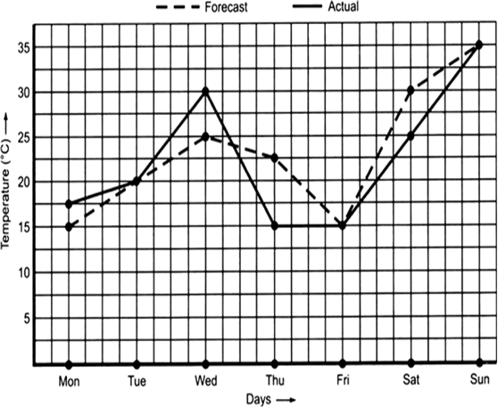

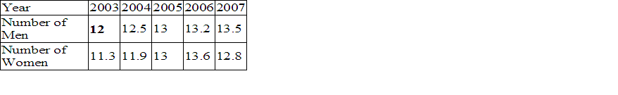
Population (in thousands) of men and women in a village in different years.
Ratana fell sick. Her doctor maintained a record of her hody temperature, taken every four hours. It is shown in the following time-temperature graph.
(a) During which period the temperature showed a rising trend?
(b) During which period the temperature showed a downward trend?
(c) At what time the temperature was highest?
(d) At what time the temperature was lowest?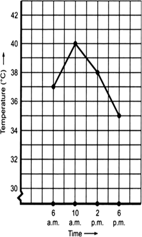
Plot the following points on a graph sheet. Verify if they lie on a line:
(a) A (4, 0), B(4, 2), C(4, 6), D(4, 2.5)
(b) P(1, 1), Q(2, 2), R(3, 3), S(4, 4)
(c) K(2, 3), L(5, 3), M(5, 5), N(2, 5)
Sponsor Area
Sponsor Area