☰
Correlation
What do you mean by a scatter diagram? How is correlation measured by this method?
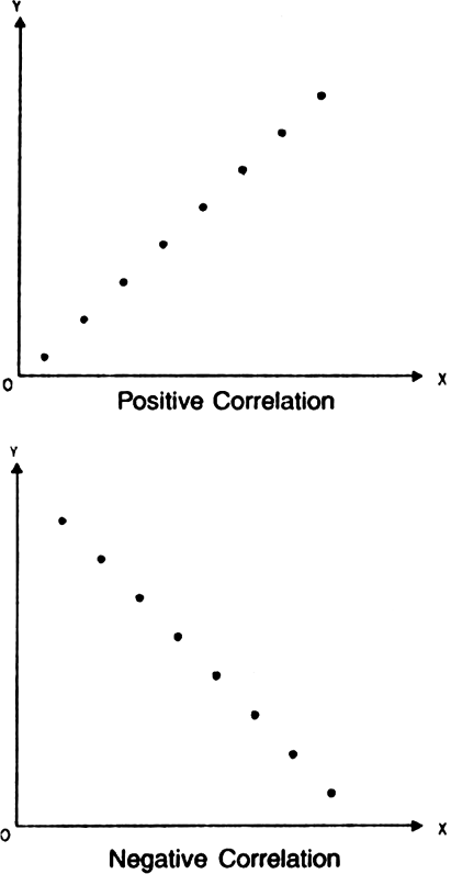
A scatter diagram : A scatter diagram is a simple visual method for getting some idea about the presence of correlation between two variables. In a scatter diagram, we plot the values of two variables as a set of points on a graph paper, the cluster of points is called scatter diagram.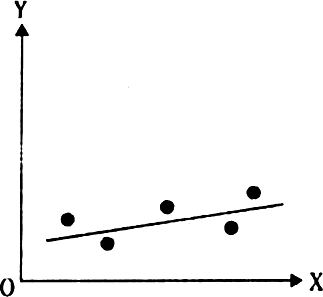
Drawing of a scatter diagram involves following steps:
1. Writting down the independent variables on X axis.
2. Writting down the dependent variables on Yaxis.
3. Points with the help of given data are marked on the graph paper.
4. When the plotted points show some trend upward or downward, we know that there is some correlation between the variables. When the trend is upward, the correlation is positive. On the other hand, when the trend is downward, the correlation is negative as shown in fig.


Sponsor Area
If precisely measured data are available the simple correlation coefficient is:
Why is r preferrred to co-variance as a measure of association?
Can r lie outside -1 and 1 range depending on the type of data?
Does correlation imply causation?
When is rank correlation more precise than simple correlation coefficient?
Does zero correlation mean independenc?
Can simple correlation coefficient measure any type of relationship?
Collect the price of five vegetables from your local market everyday for a week. Calculate their correlation coefficient. Interpret the result.
List some variables where accurate measurement is difficult.
Interpret the values of r as 1, –1 and 0.
Sponsor Area
Sponsor Area